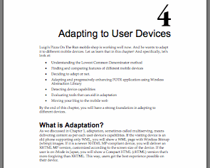
One of the biggest hurdles in mobile web development is to make the site usable on different devices. You can follow the least common denominator approach and use only those features that will work on all target phones. But many a times you want to take advantage of device specific features in your mobile web.
What do you do then?
Well, you adapt the design and content to the device! And how do you do that?
Read the Chapter 4 of my Mobile Web Development book! It shows you exactly how to adapt your XHTML MP based mobile website to different devices using WALL, WURFL etc.
Here’s the chapter outline:
- What is Adaptation?
- Do I Need Adaptation?
- Can’t I just Use Common Capabilities and Ignore the Rest?
- How to Determine the LCD?
- OK, So How do I Adapt?
- Fancy Pizza Selection
- What are Those <wall:*> Tags?
- Let’s Make Sense of This Code!
- Can I Use All XHTML Tags?
- Will This Work Well for WML?
- Device Detection and Capabilities
- XML Processing can Bog Down My Server, is There Something Easier?
- What About W3C’s DIAL?
- Other Useful Tools for Adaptation
- Dynamically Resizing Images
- Quick and Easy Way to Make Your Blog Mobile
- MyMobileWeb: Going the Semantic Way
- HAWHAW: As Simple as a Laugh?
