How is the web moving these days? What are people doing in terms of the user interface design? I saw a few examples of really well done web designs recently and found out a few common elements.
Backbase – Rich Internet Applications
I like the clean look, especially the clean top bar and the nicely done caricatures. They have a mighty AJAX toolkit and their website is a showcase. I am not too happy with the loading box but the overall feel of the site is quite fresh.
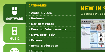
Download.com has been there for a while. I went to their site after a few years last week and liked the interface. Good use of icons and well sized ads. The AJAX use is also appreciable.
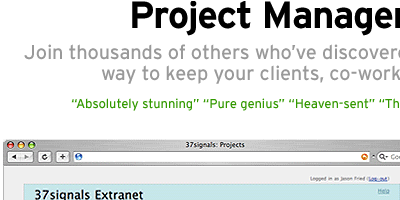
37Signals is a fine company. They are the guys behind Ruby on Rails, Basecamp, Backbase and a lot of well done websites. Usability gurus, I remember seeing their site a few years ago with principles of good design. 37Signals says they design with minimal features.
The common thread
- Clean and crisp design
- Sans serif fonts with slight round edges
- Minimal images, good icons
- Easy to navigate content
Do less, achieve more!


